Visualization
Using Tableau, create visualization for each question in the report. You will work on this independently just like last week.
To include a Tableau visualization in your report, take a screenshot, save it as an image,
put it in the learning/week2 folder, and replace  with
your own image. Please makes sure your screenshot includes the entire Tableau interface
including the controls, widgets ...etc.
Import
Data: fcq.clean.json
(a copy of this file is in your book repository already in the directory hackathons/fcq)
This dataset is provided to you in the JSON format. Your first task is to figure out how to transform this JSON file into a format that can be fed into Tableau. As a junior and senior, you are expected to be able to look around the Internet to problem solve.
What is the average course rating by department? by Heather Witte
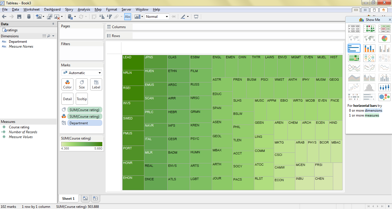
In this visualization, departments with higher course ratings on average appear in dark boxes, while departments with lower course ratings are in lighter boxes.
What should my major be if I want have a high gpa by Andrey Shprengel
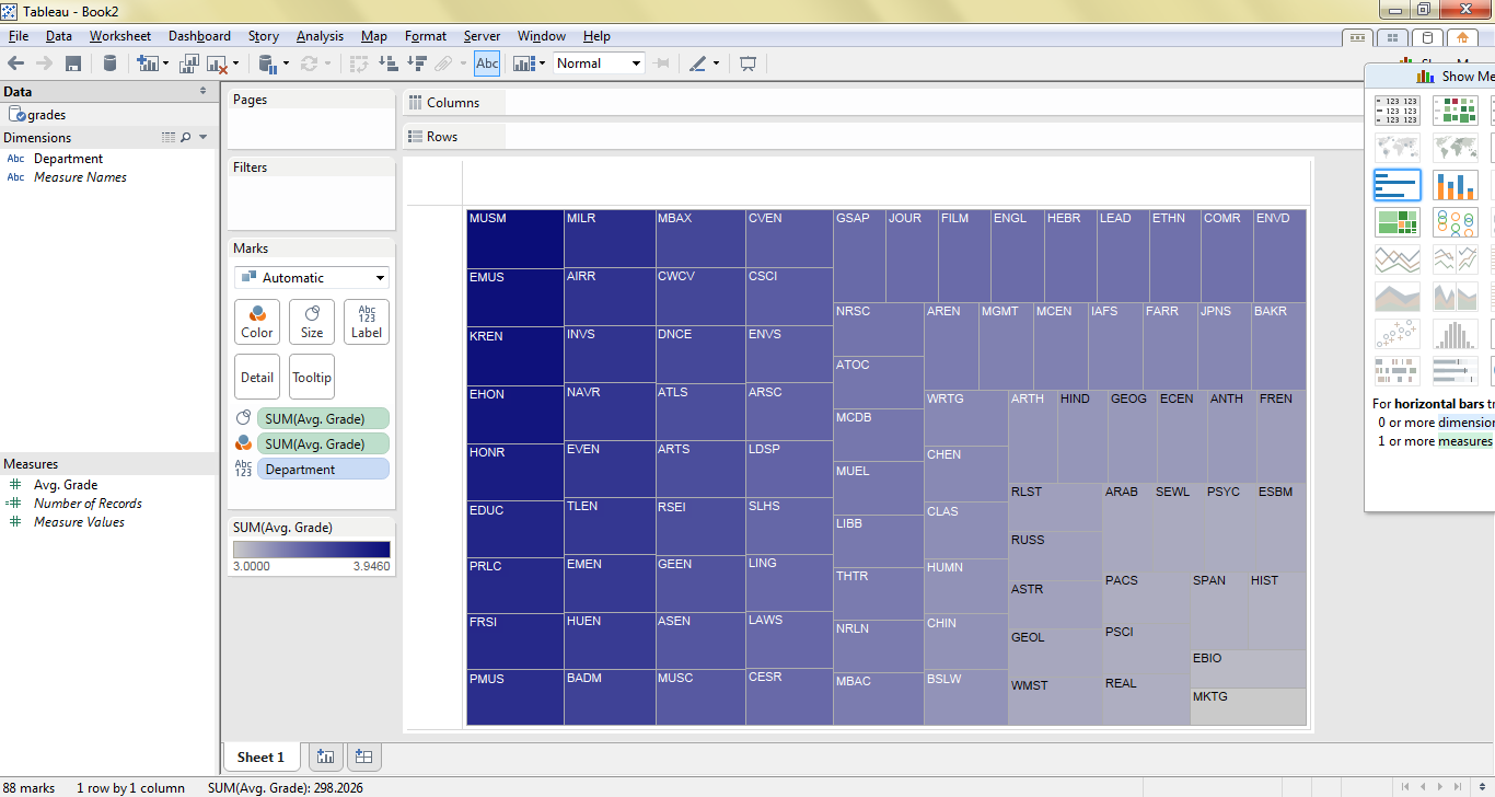
In this visualization, departments that give out higher grades on average appear in dark boxes, while departments that give out lower grades are in lighter boxes.
What professors should be fired? by Will Farmer
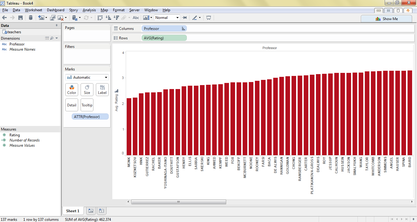
This bar chart shows ratings for professors with ratings more than 2 standard deviations below average. (Note: there are many more professors with low ratings, but the chart got cut-off when taking a screenshot)